
Ribbons
A ribbon is the band of commands across the top of an office app: tabs along the top (Home, Insert, …), and under the selected one, groups of buttons (Clipboard, Font, …), each with its name underneath. It suits an app with many commands, like a spreadsheet or a map editor, better than a menu bar alone: the common ones are a click away, with their icons.
A first ribbon
Section titled “A first ribbon”app Sheet(width: 640, height: 190) { state tab = "Home" state bold = false state italic = false state status = "Ready"
VStack(spacing: 0) { Ribbon(selection: tab) { RibbonTab("Home") { RibbonGroup("Clipboard") { RibbonButton("Paste", icon: .paste, size: .large) { status = "Pasted" } RibbonButton("Cut", icon: .cut) { status = "Cut" } RibbonButton("Copy", icon: .copy) { status = "Copied" } } RibbonGroup("Font") { RibbonToggle("Bold", icon: .bold, isOn: bold) RibbonToggle("Italic", icon: .italic, isOn: italic) RibbonMenu("Borders", icon: .borders) { MenuItem("All Borders") { status = "All borders" } MenuItem("No Border") { status = "No border" } } } RibbonGroup("Editing") { RibbonButton("Sum", icon: .sum, size: .large) { status = "Summed" } RibbonMenu("Sort", icon: .sortAscending, size: .large) { MenuItem("A to Z") { status = "Sorted A to Z" } MenuItem("Z to A") { status = "Sorted Z to A" } } } } RibbonTab("Insert") { RibbonGroup("Charts") { RibbonButton("Column", icon: .chart, size: .large) { status = "Column chart" } RibbonButton("Line", icon: .chartLine) { status = "Line chart" } RibbonButton("Pie", icon: .chartPie) { status = "Pie chart" } } } } Text(status).padding(10) Spacer() }}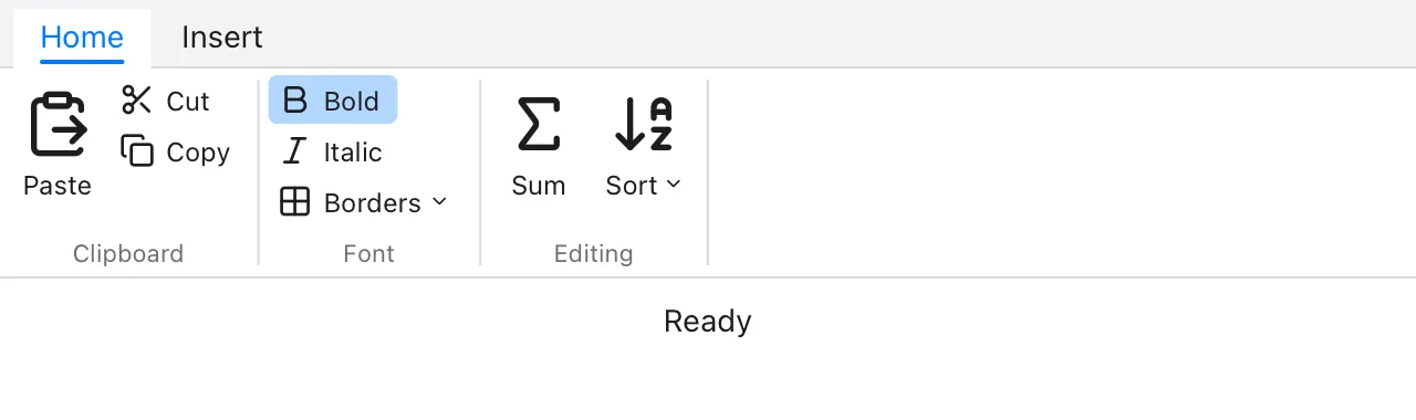
Ribbon(selection:)holds the tabs.selectionis aStringstatewith the title of the tab that’s shown; clicking a tab sets it, and setting it shows another tab.RibbonTab("Home")holds the tab’s groups, andRibbonGroup("Clipboard")a group’s items. The group’s name goes under them.- A ribbon is as wide as the space it’s in, and as tall as it needs to be
(126 points). Put it first in a
VStack(spacing: 0)above the app’s content.
Buttons, toggles and menus
Section titled “Buttons, toggles and menus”Each item has a label and one of the built-in icons (they include cut, paste, bold, italic, the alignments, table, chart, sort, filter, sum, function and more, for ribbons and toolbars):
RibbonButton("Cut", icon: .cut) { … }runs its block when clicked.RibbonToggle("Bold", icon: .bold, isOn: bold)switches aBoolon and off, and shows when it’s on.RibbonMenu("Sort", icon: .sortAscending) { … }opens a menu ofMenuItems,MenuDividers and submenus, as a context menu does.
size: .large makes an item large: its icon over its label, the height of
the group. Items are small unless they say so: the icon next to the label,
three to a column. Large items are for the commands used most, like Paste.
A group can hold other views too, such as a Picker of fonts or a
TextField for a cell’s value. They go in the group’s columns like small
items, taking the height they need.
A ribbon in several files
Section titled “A ribbon in several files”A large ribbon doesn’t have to be written in one place. A view of your own can make a tab, a group, or some of a group’s items, and the ribbon uses them as if they were written in it:
view HomeTab() {    RibbonTab("Home") {        ClipboardGroup()        RibbonGroup("Font") {            StyleButtons()        }    }}
view ClipboardGroup() {    RibbonGroup("Clipboard") {        RibbonButton("Paste", icon: .paste, size: .large) { paste() }    }}
view StyleButtons() {    RibbonButton("Bold", icon: .bold) { toggleBold() }    RibbonButton("Italic", icon: .italic) { toggleItalic() }}
Ribbon(selection: tab) { HomeTab() InsertTab() ViewTab()}When the window is narrow
Section titled “When the window is narrow”When the groups don’t fit, the ribbon shows them smaller, starting from the last group: their large items become small, and stack three to a column. Groups that still don’t fit are cut off at the window’s edge, so put the groups used most first.
Testing
Section titled “Testing”In a test script, click "Insert" selects a tab and
click "Paste" clicks an item, by their titles. A RibbonMenu’s menu
opens with click "Sort", and click "A to Z" chooses its item. tree
shows the ribbon with its selected tab:
Ribbon ["Home", "Insert"] selected "Home" RibbonTab "Home" RibbonGroup "Clipboard" RibbonButton "Paste" large RibbonButton "Cut" RibbonButton "Copy" RibbonGroup "Font" RibbonToggle "Bold" = true …A group shown smaller says small.