
Views
This page lists every built-in view, plus the app declaration. For a gentler
introduction, see Apps and views and Controls.
Reading the signatures
Section titled “Reading the signatures”Each view’s signature is written the way you would declare a view’s parameters in Tessel yourself:
TextField(_ placeholder: String, text: bind String)_in front of a name means you pass that argument without a label:TextField("Name", text: name).- Every other argument is passed with its label, in the order shown.
= valuemarks a parameter with a default; you can leave it out.bindmeans the view both reads and changes the value, so you must pass something it can change: astate, avar, abindparameter, or a field or item of one. See State and bindings.- A last parameter of type
View(namedcontent) is the block after the call:VStack { … }. A last parameter of function type, like a button’saction, can also be written as a block after the call:Button("Save") { save() }.
Modifiers such as .padding() and .font(size:) work on every view; they are
listed in Modifiers.
How views take up space
Section titled “How views take up space”Tessel lays views out like SwiftUI. Some views have a fixed natural size (text, buttons, toggles, icons) and some are flexible: they grow to fill the space they are offered.
| Flexible… | Views |
|---|---|
| horizontally only | TextField, Slider, DisclosureGroup, LazyVStack |
| in both directions | Scroll, CodeEditor, TabView, Canvas, Scene3D, Table, Tree |
| along its stack’s direction | Spacer |
| across its stack | Divider |
| when a child is flexible | VStack, HStack, ZStack, custom views |
| when given a maximum size | any view with .frame(maxWidth:) or .frame(maxHeight:) |
A fixed .frame(width:) or .frame(height:) makes a view inflexible in that
direction. See Layout for how stacks share out space.
app Name(title: String = "Name", width: Float = 640, height: Float = 480, appearance: Appearance = .system, documentTypes: [String] = []) { … }Declares the program’s window. The arguments are optional, but when you give them they need their labels and must be in this order.
| Parameter | Default | Meaning |
|---|---|---|
title | the app’s name | The window title. |
width | 640 | The window’s starting width, in points. |
height | 480 | The window’s starting height, in points. |
appearance | .system | .light or .dark to always look that way, whatever the system’s setting. |
documentTypes | [] | The extensions of the files the app opens, like ["gpkg", "geojson"]: tessel build --bundle tells the system, so Finder offers the app for them. See Opening documents. |
app Notes(title: "My Notes", width: 400, height: 300) {    state text = ""
    TextField("Write something", text: text)    Text("{text.count} characters")}
The body works like a view body: it can declare state and functions, and
everything else in it must be views. The views are stacked vertically with
8 points between them, like a VStack, and centered in the window. A program
has at most one app, and can’t have both an app and a fn main(). The
app’s body can also declare other windows.
Custom views
Section titled “Custom views”A view you declare yourself is used like a built-in one. Its body lays out
like a VStack with the default spacing (8) and centered alignment. A
modifier on a custom view applies to that whole body. See
Apps and views.
Text(_ text: String)Shows text. Use string interpolation to show values: Text("Total: {total}").
Text("Hello, world!") .font(size: 20, weight: .semibold) .color(.blue)- The text size, weight and color come from
.fontand.color(default: 14 points, regular,.primary). - Text wraps onto more lines when it’s wider than the space it’s offered.
\nin the string starts a new line. - Lines line up on the leading edge; change that with
.textAlignment. - In a frame larger than the text, the text is centered unless the frame
gives an
alignment:. .lineLimit(n)cuts it short afternlines, with ”…”;.selectable()lets the user select and copy it.
Button
Section titled “Button”Button(_ label: String, action: fn())A push button. Clicking it runs action. The action is almost always written
as a block after the call.
Button("Add one") { count += 1}- The label is drawn in the accent blue on a light gray rounded background.
.color(…)on the button changes the label color;.background(…)replaces the gray background. - The button’s size is its label plus 14 points of space on each side and 6
above and below. A
.frame(width:)or.frame(maxWidth: .infinity)makes the whole button wider. - A disabled button (
.disabled(true)) is dimmed and doesn’t respond to clicks.
TextField
Section titled “TextField”TextField(_ placeholder: String, text: bind String, secure: Bool = false, lines: Int = 1, onChange: fn() = …)A text input. text is changed as the user types. The placeholder is
shown in gray while the text is empty.
TextField("Your name", text: name) .onSubmit { save() }TextField("Password", text: password, secure: true)secure: trueis for passwords: the field shows a dot for each character, and its text can’t be copied or cut.textholds what was typed, as usual.- Click the field to start editing. Enter or Escape stops editing;
Enter also runs the field’s
.onSubmitaction. - The usual editing keys work: arrows (with Shift to select, Option/Alt for words), Cmd+A, Cmd+C, Cmd+X, Cmd+V, and Cmd+Z / Shift+Cmd+Z for undo and redo (Ctrl instead of Cmd on Windows).
- A text field is flexible horizontally: it stretches to the width it’s offered. It’s at least 120 points wide when there’s room.
lines:above 1 makes a field for text of several lines (notes, a message): it’s that many lines high, the text wraps at its width, and it scrolls when there’s more. There, Enter starts a new line, and Cmd+Enter (Ctrl+Enter on Windows) runs.onSubmitand stops editing; the up and down arrows move between lines. Asecurefield is always one line.onChangeruns after each edit that changestext: each key typed, a paste, a cut, a deletion, an undo. It doesn’t run when your program setstext. It’s usually the block after the call:TextField("Name", text: name) { dirty = true }. To act once, when the user is done, use.onSubmitinstead..autofocus()makes it start editing as soon as it appears.
SearchField
Section titled “SearchField”SearchField(_ placeholder: String = "Search", text: bind String, onChange: fn() = …)A text field for what to look for, with a magnifying glass before its text and, while there’s text, a button after it that clears it. Escape clears it too (and, when it’s empty, stops editing).
SearchField(text: query) .onSubmit { search() }Everything else is as for a one-line TextField. onChange
runs after each edit, and also when the clear button or Escape clears the
text, so a search can follow what’s typed:
SearchField(text: query) { results = find(query) }Link(_ title: String, url: String = "", action: fn() = {})Text in the accent color that opens url with
openURL when it’s clicked, and runs
action. The pointer is a hand over it.
Link("Privacy policy", url: "https://example.com/privacy")VideoPlayer
Section titled “VideoPlayer”VideoPlayer(_ path: String, playing: bind Bool = …, position: bind Float = …, controls: Bool = true, loop: Bool = false, volume: Float = 1.0)A video file (MP4, MOV), decoded by the system and drawn by Tessel, with controls: play and pause, a bar to go along it, and its time.
VideoPlayer("intro.mp4", playing: playing, position: at)playingplays or pauses it, and is set back tofalseat its end;positionis where it is in seconds, kept up to date, and jumps when it’s set. Both are optional.- Its own size, made smaller to fit; a
.framescales it to fit. - See Sound and video.
WebView
Section titled “WebView”WebView(url: String = "", html: String = "")A web page (or an HTML file, or HTML of the program’s own), shown by the
system’s browser engine in a view of the system’s over the window. It takes
all the space it’s offered, and loads again when url or html changes.
See Web pages.
RichTextEditor
Section titled “RichTextEditor”RichTextEditor(text: bind RichText, toolbar: Bool = true, onChange: fn() = {})A field to write text in with styles: bold, italic, underline,
strikethrough, sizes, colors and fonts, with a bar of buttons for them
above it (without toolbar: false). Cmd+B, Cmd+I and Cmd+U (Ctrl on
Windows) work too. onChange runs after each change. See
Rich text.
RichTextEditor(text: note)RichTextistext: Stringandruns: [TextRun]; aTextRunis a stretch fromstartup toend(in characters) withbold,italic,underline,strikethrough,size(0: the editor’s),color(.primary: the editor’s) andfont("": the editor’s).doc.markdownis the text in Markdown, andRichText.fromMarkdown(…)reads it back (bold, italic and strikethrough).- It takes all the space it’s offered, and scrolls.
.font(size:)and.color(…)on it are for text without styles of its own. - Copying takes the styles along (as HTML, with plain text, on the clipboard), and pasting text with styles from other apps keeps them.
Toggle
Section titled “Toggle”Toggle(_ label: String = "", isOn: bind Bool, onChange: fn() = …)An on/off switch. Clicking it flips isOn. The label is optional.
Toggle("Dark mode", isOn: isOn)Toggle(isOn: isOn)Toggle("Autosave", isOn: autosave) { saveSettings() }- The label sits on the leading side and the switch on the trailing side,
8 points apart. If the toggle is wider than that (for example with
.frame(maxWidth: .infinity)), the label and switch move apart. - Clicking anywhere on the toggle, label included, flips it. So does Space or Enter when the keyboard is on it.
onChangeruns after the user flips it (not when your program setsisOn). It’s usually the block after the call.- The toggle takes the click, so a
.onTapon it doesn’t run. UseonChange.
Picker
Section titled “Picker”Picker(selection: bind T, style: PickerStyle = .segmented, onChange: fn() = …, content: View)A control for choosing one of several options: a row of segments; with
style: .radio, radio buttons one above the other; with style: .menu, a
box with the chosen option that opens a list of them. Each view in the
block is one option; give each option a .tag(value).
The option whose tag equals selection is highlighted, and clicking an option
sets selection to its tag.
Picker(selection: mode) { Text("List").tag(Mode.list) Text("Grid").tag(Mode.grid)}-
selectionis usually an enum, aStringor anInt. Every tag must have the same type asselection. When the tag type is known, you can write enum cases as.tag(.list). -
Each view directly inside the block is one option, including views made by a
forloop or anif. A.tagmust be on those views themselves, not on something nested inside them. -
The options sit side by side, each with 12 points of space on either side. As radio buttons, each option is a line, with its button before it.
-
onChangeruns after the user chooses another option, with a click or the arrow keys, in every style. It doesn’t run when the option clicked is the one already chosen, or when your program setsselection. The block after the call is the options, so write it asonChange::Picker(selection: mode, onChange: { savePrefs() }) {Text("List").tag(Mode.list)Text("Grid").tag(Mode.grid)} -
The picker takes the clicks on its options, so a
.onTapon it doesn’t run. UseonChange.
Slider
Section titled “Slider”Slider(value: bind Float, from: Float = 0, to: Float = 1, step: Float = 0, onChange: fn() = …)A knob on a track, for a number between from and to. Dragging the knob,
or clicking the track, sets value.
Slider(value: opacity, from: 0, to: 1, step: 0.05) { redraw() }- With a
stepother than 0, the value moves in steps fromfrom(from,from + step, …); with 0, it can be anything in between. onChangeruns after the slider changesvalue(not when your program does). It’s usually the block after the call.- With the keyboard on it (click it, or Tab), the arrow keys move it by a step, or by a twentieth of its range.
- A slider is flexible horizontally; when nothing limits it, it is 160 points wide. It is 22 points tall.
Stepper
Section titled “Stepper”Stepper(value: bind Int or Float, step: Float = 1, from: Float = …, to: Float = …, decimals: Int = …, onChange: fn() = …)A number with − and + buttons, which make it a step smaller or larger.
Stepper(value: lineWidth, step: 0.5, from: 0, to: 10)Stepper(value: classes, from: 2, to: 12) { classify() }valueis anIntor aFloat. For anInt,stepis rounded to a whole number (at least 1).fromandtoare the smallest and largest value; leave them out for no limit. A button that can’t go further is grayed out.- The value is shown between the buttons with
decimalsdecimals: by default as many asstephas (0.5shows one,1none). onChangeruns after the stepper changesvalue.- With the keyboard on it, Up and Right step up, Down and Left step down.
ColorPicker
Section titled “ColorPicker”ColorPicker(color: bind Color, onChange: fn() = …)A swatch of color. Clicking it opens a palette over the window, with 60
colors and a field for a hex code; choosing a color sets color and closes
the palette.
ColorPicker(color: layer.fill) { redraw() }- A color chosen in the palette is stored as
.rgb(red, green, blue). The hex field takes#rrggbb,#rgbor#rrggbbaa(stored as.rgba(…)when it isn’t opaque); Enter uses it. - A click outside the palette, or Escape, closes it without changing anything.
- With the keyboard on the picker, Enter or Space opens the palette with its hex field ready to type in.
onChangeruns after the picker changescolor.- The swatch is 44 × 24 points. The palette goes below it, or above it when there’s no room below.
DatePicker
Section titled “DatePicker”DatePicker(date: bind Float, format: String = "d MMM yyyy", firstWeekday: Int = 1, onChange: fn() = …)A field that shows a date, and opens a calendar under it to pick another.
date is a time as the date functions
use it: seconds since 1970.
state due = now()
DatePicker(date: due)DatePicker(date: due, format: "EEEE, d MMMM yyyy", firstWeekday: 7) { save() }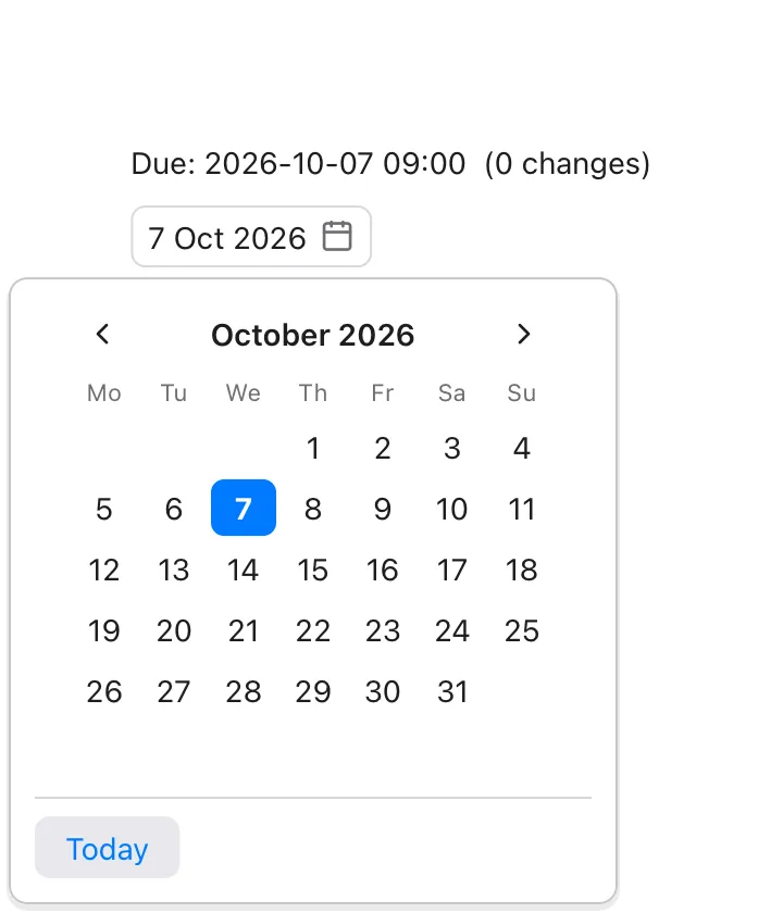
- Clicking a day sets
dateto that day and closes the calendar. The time of day ofdatestays as it was, so a date picker can sit next to controls for the hour and minute. - The arrows show the month before and after. Today picks today’s date. A click outside the calendar, or Escape, closes it without a change.
formatis how the field shows the date, asformatDatetakes it.firstWeekdayis the day weeks start on: 1 for Monday (the default) to 7 for Sunday.onChangeruns after a day is picked.- Dates are in the computer’s time zone.
Calendar
Section titled “Calendar”Calendar(date: bind Float, firstWeekday: Int = 1, onChange: fn() = …)The calendar of a DatePicker by itself, always showing: a
month of days, with date’s highlighted and today’s in blue. Clicking a day
sets date, keeping its time of day.
Calendar(date: selected) { loadEvents() }It’s 222 points wide.
TimePicker
Section titled “TimePicker”TimePicker(date: bind Float, minuteStep: Int = 5, use24Hour: Bool = true, onChange: fn() = …)The hour and minute of a time, each with arrows to change it. It works on
the same Float as a DatePicker, and leaves the day as it
is, so the two go side by side:
HStack { DatePicker(date: start) TimePicker(date: start)}- The minute’s arrows go to the next and the last multiple of
minuteStep; past the end of the hour, the hour changes too (9:58 goes to 10:00). - With
use24Hour: false, the hour is shown from 1 to 12 with AM or PM, which a click changes.
FontPicker
Section titled “FontPicker”FontPicker(family: bind String, onChange: fn() = …)A field that shows a font family, in that font, and opens the list of the families installed, each in its own font, with a field to search it.
state font = "Georgia"
FontPicker(family: font)Text("Sample").font(family: font)
family is what .font(family:) takes: a
family’s name, "monospaced", or "" for the system’s font (shown as
“System”).
ProgressBar
Section titled “ProgressBar”ProgressBar(value: Float, total: Float = 1.0)A bar that shows how far something is: value of total. It takes the
width it’s offered.
ProgressBar(value: fraction)ProgressBar(value: Float(done), total: Float(files.count))ProgressPanel
Section titled “ProgressPanel”ProgressPanel(_ title: String, value: Float, total: Float = 1.0, note: String = "", cancelLabel: String = "Cancel", onCancel: fn() = …)A title, a ProgressBar, a note and a Cancel button: the
content of a sheet that shows while work
goes on. With cancelLabel: "" there’s no button.
TextPrompt
Section titled “TextPrompt”TextPrompt(_ title: String, text: bind String, message: String = "", placeholder: String = "", confirmLabel: String = "OK", cancelLabel: String = "Cancel", onConfirm: fn() = …)A question with a text field and two buttons: the content of a sheet that asks for one text.
.sheet(isPresented: renaming) { TextPrompt("Rename", text: name) { saveName() }}The confirm button (or Enter) sets text to what was typed, closes the
sheet and runs onConfirm. The cancel button (or Escape) closes it and
leaves text as it was.
VStack
Section titled “VStack”VStack(spacing: Float = 8, alignment: Alignment = .center, content: View)Arranges its views from top to bottom.
VStack(spacing: 4, alignment: .leading) { Text("Title").font(weight: .bold) Text("Subtitle").color(.secondary)}spacingis the space between neighboring views. Hidden views get no space.alignmentlines views up across the stack:.leading,.centeror.trailing. Only the horizontal part of the alignment counts, so.topLeadingacts like.leading, and.topor.bottomlike.center.- Along the stack, the views are packed together in the middle. Use a
Spacerto push them apart. - The stack is as tall as its views plus the spacing, and as wide as its
widest view. If a view inside is flexible (a
Spacer, aScroll, aTextField, …), the stack becomes flexible in that direction too.
HStack
Section titled “HStack”HStack(spacing: Float = 8, alignment: Alignment = .center, content: View)Arranges its views from leading to trailing (left to right).
HStack(spacing: 12) { Icon(.folder) Text("Documents") Spacer() Text("12 files").color(.secondary)}alignmentlines views up across the stack, vertically:.top,.centeror.bottom. Only the vertical part counts:.topLeadingand.topTrailingact like.top,.bottomLeadingand.bottomTrailinglike.bottom..leadingand.trailingaren’t vertical positions; in anHStackthey mean.topand.bottom. Prefer writing.topand.bottom.- Otherwise it behaves like
VStack, turned sideways. Text in anHStackwraps if the row is too narrow.
ZStack
Section titled “ZStack”ZStack(alignment: Alignment = .center, content: View)Layers its views on top of each other. Later views are drawn on top.
ZStack(alignment: .topTrailing) { Icon(.bell).font(size: 24) Text("3").font(size: 10).color(.white).padding(2).background(.red, radius: 6)}- The stack is as big as its largest view.
alignmentplaces each view that is smaller than the stack; all nineAlignmentcases work.- A flexible view (like a
Scroll) fills the whole stack. ASpacerin aZStacktakes no space.
Spacer
Section titled “Spacer”Spacer()Empty space that grows along its stack’s direction: vertically in a VStack,
horizontally in an HStack.
HStack { Text("Left") Spacer() Text("Right")}.frame(maxWidth: .infinity)- Several spacers in one stack share the leftover space equally.
- A spacer makes its stack flexible, so the stack fills the space its own parent offers.
- Outside a
VStackorHStack(for example in aZStack), a spacer takes no space.
Scroll
Section titled “Scroll”Scroll(_ axes: ScrollAxes = .vertical, content: View)A scrolling area: up and down (.vertical), across (.horizontal) or both
ways (.both). Scroll with the mouse wheel or trackpad, or drag a scroll
bar: one shows at the right edge when the content is taller than the view,
and along the bottom when it’s wider; clicking beside its thumb jumps there.
Scroll { VStack(alignment: .leading) { for item in items { Text(item.name) } }}-
A scroll view is flexible in both directions: it takes all the space it’s offered, and its content can be as tall as it needs.
-
Content starts at the top leading corner.
-
Scrolling up and down only (the default), the content gets the scroll view’s width, so text wraps rather than scroll sideways. Scrolling across, it gets all the width it asks for.
-
scrollTo(id)scrolls it from code. See Scroll. -
If you put several views directly inside, they are stacked downwards like a leading-aligned
VStackwith spacing 8. Wrap them in your ownVStackto choose a different spacing or alignment.
HSplit and VSplit
Section titled “HSplit and VSplit”HSplit(size: bind Float = …, content: View)VSplit(size: bind Float = …, content: View)Two panes with a divider between them that’s dragged to share out the room:
side by side (HSplit) or one above the other (VSplit).
HSplit(size: sidebar) { LayerList().frame(minWidth: 150) MapView()}size:is the first pane’s width (VSplit: height) in points, which it keeps when the window is resized. Dragging the divider changes it. Without it, the panes start out halves.- A pane is never smaller than its
.frame(minWidth:)(minHeight:), or 24 points without one. - The panes are the first two views inside. It takes all the space it’s offered.
- In a headless run,
treeshows the first pane’s size (HSplit 220), anddragon the divider moves it. - See Split views.
Grid and GridRow
Section titled “Grid and GridRow”Grid(alignment: Alignment = .leading, spacing: Float = 8, rowSpacing: Float = spacing, content: View)GridRow(content: View)Rows of cells in columns that line up. Each GridRow in the block is a
row, and each view in it a cell; a column is as wide as its widest cell.
Grid { GridRow { Text("Width").gridColumnAlignment(.trailing) TextField("", text: width) } GridRow { Text("Height") TextField("", text: height) }}spacingis between columns (and rows, withoutrowSpacing).alignmentplaces each cell in its row and column (.leading: at the left, centered from top to bottom)..gridColumnAlignmentlines up one column, and.gridCellColumnsmakes a cell take several.- A view in the block that isn’t a
GridRowis a row of its own, as wide as the grid. AGridRowcan come from a view of the program’s own. - A column with a flexible cell (a text field, a view with
.frame(maxWidth:)) shares the room left over; then the grid is flexible across too. - Outside a
Grid, aGridRowlays out like anHStack. - See Grids.
LazyVStack
Section titled “LazyVStack”LazyVStack(count: Int, rowHeight: Float, content: fn(Int) -> View)count rows of rowHeight points each, top to bottom, of which only those
near the part that shows are built. The block after the call builds row
number i (from 0):
Scroll { LazyVStack(count: features.count, rowHeight: 22) { i in Text(features[i].name) }}- It’s for long lists inside a
Scroll: a list of 100 000 rows builds the few dozen that show (and about a screenful more on each side), and builds others as it’s scrolled. - Every row is
rowHeighttall and as wide as the list; what’s in it is laid out like a leading-alignedVStackwith no spacing, centered vertically. - Each row is known by its number, so a row’s
state(in a custom view) stays with it while it’s built, but a row that scrolls far out of view is built afresh when it comes back. - The list is as tall as all its rows, and flexible horizontally.
- In a headless run,
treeshows only the rows built:LazyVStack 100000 rows, built 1990..2020.
LazyHStack
Section titled “LazyHStack”LazyHStack(count: Int, columnWidth: Float, content: fn(Int) -> View)A LazyVStack on its side: count columns of columnWidth
points each, of which only those near what shows are built. Put it in a
Scroll(.horizontal).
- Each column is as tall as the list, its views centered across it.
- The list is as wide as all its columns, and flexible vertically.
- In a headless run,
treeshows the columns built:LazyHStack 10000 columns, built 40..67.
Table(rows: Int, rowHeight: Float = 24, selection: bind [Int] = …, sortColumn: bind Int = …, ascending: bind Bool = …, onSort: fn() = …, multiple: Bool = true, onOpen: fn(Int) = …, columns: View)Rows of the program’s data in columns, under a header. The block gives the
columns, as TableColumns (and nothing else). See
Tables and trees.
rowsrows ofrowHeightpoints are shown, of which only those near what shows are built, as in aLazyVStack.selectionholds the numbers of the rows selected, in order: a click selects a row, Shift-click a range, Cmd-click (Ctrl on Windows) adds or takes one out; the arrow keys, Home, End, Page Up and Page Down move it.multiple: falseallows one row only.- A click on a column’s title sets
sortColumn(its number from 0) andascending(again: the other way), shows an arrow by it, and runsonSort, which puts the program’s rows in that order. WithoutsortColumn, titles aren’t clicked. - A double-click on a row, or Enter, runs
onOpenwith its number. - The user can drag the edge between two titles to resize a column.
- A table is flexible in both directions, and scrolls its rows; it’s 320 points tall when nothing limits it.
TableColumn
Section titled “TableColumn”TableColumn(_ title: String, width: Float = …, alignment: Alignment = .leading, onEdit: fn(Int, String) = …, cells: fn(Int) -> View)A column of a Table: cells builds its cell in row i.
Without width, the columns that have none share the room the others
leave (each at least 80 points). alignment (.leading, .center or
.trailing) lines up its cells and its title.
With onEdit, its cells can be edited: a double click on one (or Enter on
a row, in a table without onOpen) shows a text field with the cell’s text
(its first Text’s). Enter or a click elsewhere passes the row and what was
typed to onEdit; Escape drops it; Tab passes it on and edits the next
cell that can be. See Editing cells.
Tree(children: fn([Int]) -> Int, rowHeight: Float = 24, selection: bind [Int] = …, onOpen: fn([Int]) = …, rows: fn([Int]) -> View)The program’s nested data, a level at a time. Each node is known by its
path, the place of it and of the nodes above it ([1, 0]: the first child
of the second node at the top). children says how many children the node
at a path has ([]: the top); rows builds the row of the node at a path.
See Tables and trees.
- A node with children has an arrow that opens and closes it; the right and left arrow keys do too (left on a closed node goes to its parent).
selectionholds the selected node’s path ([]for none), andonOpenis given it on a double-click or Enter.- Only the rows near what shows are built.
Image(_ path: String)Shows an image file. The path is relative to the folder the program is run
from (see currentFolder()). For a
picture that comes with the app, join it to
appFolder():
Image(joinPath(appFolder(), "logo.png")).
Image("logo.svg").frame(width: 48, height: 48)- SVG files (
.svg) are drawn at the size the SVG declares. With a.frame(width:)or.frame(height:), the drawing is scaled to fit the frame, keeping its proportions.currentColorin the SVG is drawn in the view’s.color. - PNG and JPEG files are drawn one point for each pixel, or smaller when
there’s less room. A
.framescales them to fit it (larger too), keeping their proportions. A photo is shown the way up its camera recorded. - Other files, and files that can’t be read, show a 64 × 64 gray placeholder box.
- The file is read once, and again when it changes.
Markdown
Section titled “Markdown”Markdown(_ text: String, folder: String = "", onLink: fn(String)? = nil)Shows text written in Markdown: headings,
paragraphs with bold, italic, code and links, lists, quotes, blocks
of code, tables, pictures and rules. It’s for longer or richer text than a
Text: help pages, release notes, a message with a link in it.
Markdown("## Welcome\n\nRead the [guide](/guide/) or just *start typing*.", onLink: { link in open(page: link)})- It’s as wide as the space it’s given, and as tall as its text needs then.
Put it in a
Scrollwhen it may be longer than the window. - The text’s size and color are the view’s (
.font,.color); headings are larger in proportion. - Links. A click on a link calls
onLinkwith the link’s address, exactly as written. WithoutonLink, links to the web (http://,https://) open in the browser, and other links do nothing. - Pictures (
) are PNG and JPEG files, looked for infolder(or in the folder the program runs from). A picture that’s wider than the view is made to fit. One that can’t be read is replaced by its description. - Code. A block marked
tesselgets Tessel’s syntax colors. Long lines wrap. - Tables are as wide as their text, and wrap their cells when that’s wider than the view.
- HTML in the text isn’t shown. Text can’t be selected.
Icon(_ name: IconName)One of Tessel’s built-in icons. See Icons for the full list.
HStack(spacing: 6) { Icon(.warning).color(.orange) Text("3 problems")}- An icon is a square whose side is 1.15 times the font size, rounded (16
points at the default size of 14). Change it with
.font(size:). - It is drawn in the current
.color, so it matches the text around it.
Svg(_ source: String)Draws SVG markup written in the program.
Svg("<svg xmlns='http://www.w3.org/2000/svg' width='24' height='24'><circle cx='12' cy='12' r='10' fill='currentColor'/></svg>") .color(.green)- Sizing works like an SVG
Image: the SVG’s ownwidthandheight, scaled to fit a.frameif there is one. currentColoris drawn in the view’s.color.- Markup that isn’t valid SVG draws nothing (in a 16 × 16 space).
CodeEditor
Section titled “CodeEditor”CodeEditor(text: bind String, errorLines: [Int] = [], line: bind Int = …, completions: [Completion] = [], completionStart: Int = …, onComplete: fn(Int) = …, breakpoints: [Int] = [], stoppedLine: Int = 0, onBreakpoint: fn(Int) = …, onChange: fn() = …, errorRanges: [Range] = [], highlights: [Range] = [], onHover: fn(Int) = …, hoverText: String = "", hoverAt: Int = -1, onDefinition: fn(Int) = …, onUses: fn(Int) = …, onRename: fn(Int) = …, onCaret: fn(Int) = …, caret: bind Int = …, matches: [Range] = [], selection: bind Range = …)A multi-line code editor with line numbers and Tessel syntax colors. It’s what the Tessel IDE uses. See Code editor.
CodeEditor(text: code, errorLines: errors, line: line)| Parameter | Meaning |
|---|---|
text | The code being edited. Changed as the user types. |
errorLines | Line numbers (starting at 1) to mark with a red band and a red bar in the margin. |
line | Optional. The line the caret is on, starting at 1. The editor updates it as the caret moves, and when your program sets it, the caret jumps to the start of that line. |
completions, completionStart, onComplete | Optional. Suggestions shown as the user types; see Code completion. |
onChange | Optional. Runs after each edit that changes text (not when your program sets it), as for a TextField. |
errorRanges, highlights, onHover, hoverText, hoverAt, onDefinition, onUses, onRename, onCaret, caret | Optional. Underlined errors, highlighted uses, hover text, and Cmd-click, F12, Shift+F12 and F2 on a name; caret is the caret, as a byte offset, both ways. See Understanding code. |
matches, selection | Optional. What a search found, marked, and what’s selected, both ways, in bytes. See Finding text. |
- Text is drawn in a 13-point monospaced font, which
.fontdoesn’t change. - Enter keeps the current line’s indentation, adding one level (4
spaces) after a line ending in
{. Tab inserts 4 spaces. Typing}on a line that is only spaces removes one level. - The editor is flexible in both directions. When nothing limits it, it is 480 × 320 points; it is never smaller than 160 × 80.
TabView
Section titled “TabView”TabView(selection: bind T, onClose: fn(T) = …, content: View)Pages with a row of tabs at the top. Each view in the block is one page. Give
each page a .tabItem("Title") for its tab
and a .tag(value) to identify it.
TabView(selection: tab) { Text("Welcome!").tabItem("Home").tag("home") Text("No settings yet").tabItem("Settings").tag("settings")}- The page whose tag equals
selectionis shown; clicking a tab setsselectionto that page’s tag. If no page matches, the first page is shown. - A page without
.tabItemgets the title “Untitled”. - With
onClose:, tabs get a close button (shown on the selected tab and the tab under the mouse). Clicking it callsonClosewith that page’s tag. The tab view doesn’t remove the page itself; remove it from your data inonClose:
TabView(selection: current, onClose: { name in close(name) }) { for doc in docs { Text(doc.text).tabItem(doc.name).tag(doc.name) }}- The tab bar is 34 points tall. The tab view is flexible in both directions; when nothing limits it, it is 480 × 320 points.
DisclosureGroup
Section titled “DisclosureGroup”DisclosureGroup(_ title: String, isExpanded: bind Bool, content: View)A title with an arrow; clicking it opens or closes the group, showing or hiding its content below, indented.
DisclosureGroup("Layers", isExpanded: showLayers) { for layer in layers { Text(layer.name) }}- The content is built only while the group is open.
- Groups inside groups make a tree; see Trees.
- With the keyboard on it, Enter or Space opens or closes it, Right opens it and Left closes it.
- The content is indented 18 points, 4 points below the title, with 4 points between its views. The group is flexible horizontally.
Canvas
Section titled “Canvas”Canvas(redraw: Int = …, draw: fn(Graphics))A view the program draws itself. draw is almost always the block after
the call; it gets a Graphics to draw with. See
Drawing and the mouse.
Canvas { g in g.fillRect(x: 0, y: 0, width: g.width, height: g.height, color: .sidebar) g.fillCircle(x: g.width / 2, y: g.height / 2, radius: 20, color: .blue) g.text("Hello", x: g.width / 2, y: 8, align: .top)}.frame(width: 200, height: 120)- Coordinates are in points from the canvas’s top left corner (inside its
padding);
ygrows downwards. Nothing is drawn outside the canvas. - A canvas is flexible in both directions. When nothing limits it, it is 300 × 150 points.
- Without
redraw:, the block runs each time the window is drawn. With it, the drawing is kept, and the block runs again only when the number is different from last time, the canvas’s size changes, or the appearance switches between light and dark. - The block shouldn’t change
state. - In a headless run,
treeshows what was drawn:Canvas (2 fills, 1 text).
Graphics
Section titled “Graphics”What a Canvas’s block (and renderImage’s)
draws with. It has two fields, width and height: the size of the canvas
in points. Its methods draw on the canvas being drawn; called at any other
time, they do nothing. Angles are in radians.
A path is an outline, built up and then drawn:
| Method | |
|---|---|
beginPath() | Starts a new, empty path. |
moveTo(_ x, _ y) | Starts a part of the path at a point. |
lineTo(_ x, _ y) | A straight line to a point. |
quadTo(_ cx, _ cy, _ x, _ y) | A curve to (x, y), pulled towards (cx, cy). |
curveTo(_ c1x, _ c1y, _ c2x, _ c2y, _ x, _ y) | A curve to (x, y) that leaves towards the first control point and arrives from the second (a cubic Bézier). |
closePath() | A line back to where the part started. |
lines(_ points: [Float], closed: Bool = false) | A part through many points, given as x, y, x, y, …; closed too, with closed: true. Points that aren’t numbers (NaN) are left out. |
rect(x:, y:, width:, height:, radius: = 0) | A rectangle, with rounded corners if radius is given. |
circle(x:, y:, radius:) | A circle around (x, y). |
ellipse(x:, y:, radiusX:, radiusY:) | An ellipse around (x, y). |
arc(x:, y:, radius:, from:, to:) | Part of a circle, from one angle to another (0 is to the right; angles grow clockwise). |
fill(_ color: Color, evenOdd: Bool = false) | Fills the path. With evenOdd: true, a part inside another is a hole. |
stroke(_ color: Color, width: Float = 1, dash: [Float] = []) | Draws the path’s line. dash is the lengths of dashes and gaps in turn, like [6, 3]. |
fill and stroke keep the path, so it can be filled and then outlined.
Gradients (they keep the path too). colors are spread evenly, or put at
stops (one for each color, from 0 at the start to 1 at the end). The
points are in the current coordinates, and turn and scale with the transform.
| Method | |
|---|---|
fillLinear(x1:, y1:, x2:, y2:, colors: [Color], stops: [Float] = [], evenOdd: = false) | Fills the path with colors that change along the line from (x1, y1) to (x2, y2): the first color before it, the last after it. |
fillRadial(x:, y:, radius:, colors: [Color], stops: [Float] = [], evenOdd: = false) | Fills the path with colors that change from (x, y) out to radius from it. |
strokeLinear(x1:, y1:, x2:, y2:, colors: [Color], stops: [Float] = [], width: = 1, dash: = []) | Draws the path’s line in colors that change along a line. |
strokeRadial(x:, y:, radius:, colors: [Color], stops: [Float] = [], width: = 1, dash: = []) | Draws the path’s line in colors that change out from a point. |
Shapes drawn at once (they leave the path alone):
| Method | |
|---|---|
line(_ x1, _ y1, _ x2, _ y2, color:, width: = 1) | A straight line. |
fillRect(x:, y:, width:, height:, color:, radius: = 0) | A filled rectangle. |
strokeRect(x:, y:, width:, height:, color:, lineWidth: = 1, radius: = 0) | A rectangle’s outline. |
fillCircle(x:, y:, radius:, color:) | A filled circle. |
strokeCircle(x:, y:, radius:, color:, lineWidth: = 1) | A circle’s outline. |
Text and pictures:
| Method | |
|---|---|
text(_ text, x:, y:, size: = 14, color: = .primary, weight: = .regular, align: = .topLeading, angle: = 0, halo: = .clear, haloWidth: = 0, italic: = false, family: = "system", kerning: = true, tracking: = 0) | Text at a point. align (an Alignment) says which part of the text sits on the point; angle turns it around the point; a halo is an outline of haloWidth points in another color, under the text. family is a font family, as for .font. kerning: false leaves out the font’s kerning (the pairs of letters it moves closer, like AV); tracking adds that many points after each letter (less, if negative). |
textWidth(_ text, size: = 14, weight: = .regular, italic: = false, family: = "system", kerning: = true, tracking: = 0) -> Float | How wide text would be drawn, with the spaces at its end (so " " is the width of a space). |
textPath(_ text, x:, y:, size: = 14, weight: = .regular, align: = .topLeading, italic: = false, family: = "system", kerning: = true, tracking: = 0) | Adds the outline of text, as text would draw it there, to the path: to fill, stroke, or clip by. The curves are the font’s own. See textOutline for the outline as numbers. |
image(_ path, x:, y:, width:, height:, opacity: = 1) -> Bool | A PNG or JPEG file, stretched to the rectangle. false if there’s no such picture. |
image(pixels: [Int], pixelWidth: Int, pixelHeight: Int, x:, y:, width:, height:, opacity: = 1) -> Bool | A picture from pixels in memory, row by row from the top left, each as writeImage takes them, stretched to the rectangle. Kept between frames while the pixels stay the same. false if the size isn’t from 1 to 8192 or there are fewer pixels than it needs. |
svg(_ path, x:, y:, width:, height:, color: = .primary, opacity: = 1) -> Bool | An SVG file, scaled to fit the rectangle and centered in it; currentColor in it is color. false if it can’t be read. |
svg(text:, x:, y:, width:, height:, color: = .primary, opacity: = 1) -> Bool | The same, for SVG source. |
Pages:
| Method | |
|---|---|
newPage(width: =, height: =) | In writePDF, ends the page and goes on to a new one, with nothing transformed or clipped. The new page is width × height points; a size left out is the page before’s. Elsewhere it does nothing. |
The transform, which says where coordinates land, and clipping:
| Method | |
|---|---|
translate(_ x, _ y) | Moves what follows: (0, 0) is now where (x, y) was. |
scale(_ x, _ y) | Makes what follows x times as wide and y times as tall. A negative number flips it. |
rotate(_ angle) | Turns what follows around (0, 0). |
zoom(_ factor) | Draws what follows factor times larger as a whole: positions like scale(factor, factor), and line widths and text sizes too. For a small copy of a drawing, or a page shown at less than its size. |
resetTransform() | Back to the canvas’s own coordinates. |
save() | Remembers the transform (and the clips). |
restore() | Goes back to what the matching save() remembered. |
clip(x:, y:, width:, height:) | Until the matching restore(), only what’s inside the rectangle shows. |
clipPath(evenOdd: = false) | The same, for the current path: only what’s inside it shows (for hatching a shape, or a picture in a circle). |
Layers:
| Method | |
|---|---|
beginLayer(blend: BlendMode = .normal, opacity: = 1) | What’s drawn until the matching endLayer() is drawn on its own, then put onto the drawing under it as a whole: blended as blend says (a BlendMode), at opacity. Layers nest. |
endLayer() | Ends the layer the last beginLayer began, and the clips begun in it. restore() also ends the layers begun since its save(). |
The transform applies to the points of paths and shapes, to the corners of
pictures and SVGs, to the points of gradients, and to the point a text sits on. Line widths, dashes and text
sizes are always in points: scaling doesn’t make lines thicker or text
larger. zoom is the exception: it enlarges those too.
Scene3D
Section titled “Scene3D”Scene3D(redraw: Int = …, draw: fn(Scene))A view that shows shapes in three dimensions. draw is almost always the
block after the call; it gets a Scene to fill. See
3D scenes.
Scene3D { s in s.camera(x: 3, y: 2, z: 4) s.box(color: .red) s.sphere(radius: 0.4, color: .blue, y: 0.9)}.frame(width: 300, height: 200)- A scene is flexible in both directions. When nothing limits it, it is 300 × 150 points.
- It has no background unless
s.backgroundgives it one: what’s under the view shows around the shapes. - Without
redraw:, the block runs each time the window is drawn, and the picture is made again only when what the block said has changed. With it, the block runs again only when the number is different from last time, the view’s size changes, or the appearance switches between light and dark. - The block shouldn’t change
state. - Where there’s no graphics card to use, the view is an empty box.
- In a headless run,
treeshows what’s in the scene:Scene3D (2 shapes, 812 triangles).
What a Scene3D’s block fills. It has two fields, width and height:
the size of the view in points. Its methods add to the scene being made;
called at any other time, they do nothing. x goes to the right, y up
and z towards the viewer; angles are in radians.
Shapes. Each has x:, y: and z: (0 unless given) for where its
middle is, color: (.gray unless given), and last opacity: (1 unless
given): how much of it shows, from 0 to 1. A shape with less than 1, or
with a see-through color, lets what’s behind it show.
| Method | |
|---|---|
box(width: = 1, height: = 1, depth: = 1, color:, x:, y:, z:, opacity:) | A box. |
sphere(radius: = 0.5, color:, x:, y:, z:, opacity:) | A ball. |
cylinder(radius: = 0.5, height: = 1, color:, x:, y:, z:, opacity:) | A cylinder, standing up, with closed ends. |
cone(radius: = 0.5, height: = 1, color:, x:, y:, z:, opacity:) | A cone, its point up. |
plane(width: = 1, depth: = 1, color:, x:, y:, z:, opacity:) | A flat sheet, lying down. |
mesh(vertices: [Float], triangles: [Int] = [], color:, colors: [Color] = [], smooth: Bool = false, opacity:) | Triangles: vertices is x, y, z for each point, and triangles three points’ numbers (from 0) for each triangle. Without triangles, every three points are one. colors gives each point its own color (a point without one takes color), and a triangle goes from one of its points’ colors to the others’. smooth shades across the edges between triangles that share points. A number of a point that isn’t there leaves the mesh out. |
surface(heights: [Float], columns: Int, width: = 1, depth: = 1, color:, colors: [Color] = [], opacity:) | A sheet over a grid columns across, width × depth around the middle: heights is the height at each point, row by row from the back. With colors, each point is colored by its height, from the first (the lowest) to the last. Fewer than 2 columns or 2 rows show nothing. |
Lines and text. Their color: is .primary unless given.
| Method | |
|---|---|
line(_ x1, _ y1, _ z1, _ x2, _ y2, _ z2, color:) | A line one pixel wide. |
lines(_ points: [Float], color:, closed: Bool = false) | A line through points given as x, y, z, …; back to the first too, with closed: true. |
label(_ text: String, x:, y:, z:, size: = 12, color:) | Text centered on a point. It faces the viewer, is size points high wherever the camera is, and shows over the shapes. |
The view and its light.
| Method | |
|---|---|
camera(x:, y:, z:, lookAtX: = 0, lookAtY: = 0, lookAtZ: = 0, fieldOfView: = 45) | Where the scene is seen from, and the point at the middle of the view. fieldOfView is the angle seen from top to bottom, in degrees. Without a camera, a scene is seen from (3, 2.5, 4). |
orbit(distance:, yaw: = 0.6, pitch: = 0.4, x:, y:, z:, fieldOfView: = 45) | The camera distance from (x, y, z), turned yaw around it and raised pitch above it. |
light(x:, y:, z:, color: = .white, strength: = 1) | Light from the direction of (x, y, z), the same on every shape. Up to 4; with none, a scene is lit from over the viewer’s left shoulder. |
ambient(_ amount: Float) | The light there is everywhere, from 0 to 1 (0.3 unless set). |
background(_ color: Color) | What’s behind the shapes. |
Transforms apply to what’s added after them.
| Method | |
|---|---|
translate(_ x, _ y, _ z) | Moves. |
scale(_ x, _ y, _ z) | Sizes, along each axis. |
rotateX(_ angle), rotateY(_ angle), rotateZ(_ angle) | Turns around an axis. |
save(), restore() | Remembers the transform, and goes back to it. |
Divider
Section titled “Divider”Divider()A thin gray line (the .separator color) that separates views.
VStack { Text("Above") Divider() Text("Below")}- In a
VStackit runs horizontally across the whole stack; in anHStackit runs vertically. It is 1 point thick. - It makes its stack stretch across the space offered, so a
Dividerin anHStackmakes the row as tall as the space available.
MenuItem
Section titled “MenuItem”MenuItem(_ title: String, shortcut: String = "", checked: Bool = false, action: fn())An item of a menu: of a .contextMenu,
of the .menuBar, or of a Menu
in them. Choosing it runs action.
Text("Roads").contextMenu { MenuItem("Zoom to Layer", shortcut: "cmd+shift+z") { zoom() } MenuItem("Visible", checked: visible) { visible = !visible } MenuItem("Remove") { remove() }.disabled(locked)}shortcut:shows the keys next to the title, and in the menu bar they choose the item. They’re written"cmd+shift+z"or"⇧⌘Z"; see Shortcut keys.checked: trueshows a check mark..disabled(…)grays it out;.hidden(…)leaves it out.- It can only be used in a menu (
tessel checksays so otherwise).
MenuDivider
Section titled “MenuDivider”MenuDivider()A line between groups of items in a menu.
Menu(_ title: String, items: View)A menu of items: one of the .menuBar’s
menus, or a submenu in another menu, which opens beside it.
.menuBar { Menu("File") { MenuItem("Open…", shortcut: "cmd+o") { open() } Menu("Open Recent") { for path in recent { MenuItem(path.fileName) { open(path) } } } }}Its items are MenuItems, MenuDividers and other Menus (or views of
your own made of them), built with if and for like other views.
.disabled(…) on a Menu disables all of its items. See
Menus, windows and documents.
Window
Section titled “Window”Window(_ title: String, isOpen: bind Bool, width: Float = 480, height: Float = 360, content: View)Another window of the app, open while isOpen is true. Only the app’s
body can declare one.
app Survey {    state showTable = false
    Toggle("Attribute Table", isOn: showTable)
Window("Attribute Table", isOpen: showTable, width: 280, height: 220) { Text("3 points") }}- It shares the app’s state; its content lays out like the main window’s.
It can have its own
.statusBar. - When the user closes it,
isOpenbecomesfalse; setting it tofalsecloses the window, ascloseWindow()from a view inside it does. - See More windows.
Ribbon
Section titled “Ribbon”Ribbon(selection: bind String, content: View)A band of tabs of commands, as office apps have. Its content is
RibbonTabs; the one whose title is selection is shown,
and clicking a tab sets selection to its title. If none matches, the
first is shown.
Ribbon(selection: tab) { RibbonTab("Home") { RibbonGroup("Clipboard") { RibbonButton("Paste", icon: .paste, size: .large) { paste() } RibbonButton("Copy", icon: .copy) { copy() } } }}- It’s as wide as the space it’s in and 126 points tall.
- When its groups don’t fit, they show their items small, from the last group on.
- See Ribbons.
RibbonTab
Section titled “RibbonTab”RibbonTab(_ title: String, content: View)A tab of a Ribbon, and only there. Its content is
RibbonGroups, side by side.
RibbonGroup
Section titled “RibbonGroup”RibbonGroup(_ title: String, icon: IconName = …, content: View)A group of a RibbonTab’s items, with title under them. A
large item has a column of its own; small items, and other views (a
Picker, a TextField), stack in columns, three small ones to a column.
In a window too narrow for it, it folds
into one button, with icon (its first item’s icon by default), that
opens it.
RibbonButton
Section titled “RibbonButton”RibbonButton(_ label: String, icon: IconName, size: RibbonSize = .small, action: fn())A button of a ribbon: its icon and label, side by side
(.small) or the icon over the label (.large). Clicking it runs action.
RibbonToggle
Section titled “RibbonToggle”RibbonToggle(_ label: String, icon: IconName, size: RibbonSize = .small, isOn: bind Bool, onChange: fn() = …)Like RibbonButton, but clicking it switches isOn, and it’s highlighted
while isOn is true (Bold, Italic, …). onChange runs after a click
switches it.
RibbonMenu
Section titled “RibbonMenu”RibbonMenu(_ label: String, icon: IconName, size: RibbonSize = .small, content: View)Like RibbonButton, with an arrow; clicking it opens a menu of its
content, which is MenuItems, MenuDividers
and Menus for submenus.