
Icons, SVG and images
Tessel has three views for pictures:
Icon(.name)shows one of the built-in icons;Svg("<svg …>")draws SVG markup written in your program;Image("file.svg")draws an SVG file.
Built-in icons
Section titled “Built-in icons”HStack(spacing: 12) { Icon(.folder) Icon(.fileCode).color(.blue) Icon(.play).color(.green) Icon(.stop).color(.red) Icon(.settings).font(size: 24) Icon(.warning).font(size: 24).color(.orange) Icon(.heart).font(size: 32).color(.pink)}HStack(spacing: 6) { Icon(.circleCheck).color(.green) Text("All tests passed")}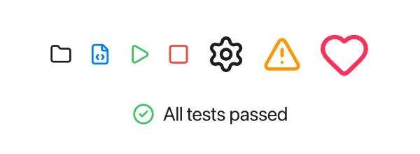
An icon behaves like a piece of text:
- Its size follows the font size. An icon is a square a little larger than
the current font size (16 points at the default 14), so it lines up with the
text next to it. Change it with
.font(size:). - Its color follows
.color. Icons are drawn in the current text color, and like text they inherit.fontand.colorfrom the stack around them.
The icons come from the Lucide set (ISC license). See
the icon reference for every name, such as .folder,
.trash, .search, .chevronRight and .settings.
Icon names are values of the built-in IconName type, so you can store them
in state, pass them to your own views, or choose one with if:
view ToolButton(icon: IconName, label: String, action: fn()) {    HStack(spacing: 5) {        Icon(icon)        Text(label)    }    .padding(6)    .onTap { action() }}
app Player(width: 300, height: 120) {    state liked = false
    Icon(if liked { .heart } else { .star }).color(.pink)    ToolButton(icon: .heart, label: "Like") { liked = !liked }}
To make an icon clickable, add .onTap,
and .hoverBackground so it looks
clickable.
Your own SVG with Svg
Section titled “Your own SVG with Svg”Svg draws SVG markup that you write as a string. Since Tessel strings use
double quotes, use single quotes for the SVG’s attributes:
Svg("<svg xmlns='http://www.w3.org/2000/svg' width='40' height='40'><circle cx='20' cy='20' r='18' fill='#34c759'/><path d='M12 20l6 6 10-12' stroke='white' stroke-width='4' fill='none'/></svg>")
Svg("<svg xmlns='http://www.w3.org/2000/svg' viewBox='0 0 40 40'><rect x='4' y='4' width='32' height='32' rx='8' fill='none' stroke='currentColor' stroke-width='4'/></svg>")    .color(.purple)    .frame(width: 60, height: 60)
- Size. An SVG is drawn at the size it declares with its
widthandheightattributes (or itsviewBox, if it has no width and height). Give it a.frame(width:height:)to scale it; it keeps its proportions and is centered in the frame. - Color. Wherever the SVG says
currentColor, Tessel uses the view’s current.color, just like it does for icons. That’s how the second shape above turns purple. - If the markup isn’t valid SVG, nothing is drawn.
Picture files with Image
Section titled “Picture files with Image”Image shows a picture from a file: an SVG, a PNG or a JPEG.
Image("assets/logo.svg").frame(width: 80)Image("assets/photo.jpg")Image("assets/photo.jpg").frame(height: 100)The path is relative to the folder the app is started from (the current folder), not to the source file.
- SVG files work like
Svg: they have their own size, scale with.frame, and usecurrentColor. - PNG and JPEG files are as large as their pixels, one point for each, and
made smaller when there’s less room than that. A
.frame(width:)or.frame(height:)scales the picture to fit, keeping its proportions; with both, it’s centered in the frame. Transparent parts of a PNG show what’s behind it.
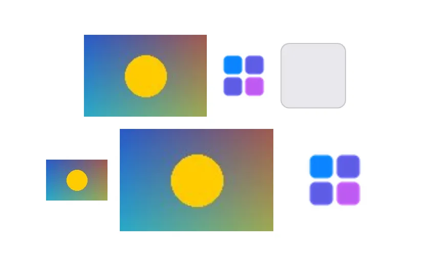
When the file can’t be read, or it’s another kind of file, Image shows a gray
placeholder box instead (64 × 64 points unless you give it a frame), like the
third one above. A picture is read again when its file changes.