
Text and styling
Views have a plain look until you style them with modifiers. This page covers text and the modifiers that change appearance. For sizes and positions, see Layout and Alignment.
Text shows a string:
Text("Hello, world!")Text("You have {count} new messages")Text("First line\nSecond line")Text can contain {…} interpolation, like any Tessel string, and \n starts a
new line. When a text is offered less width than it needs, it wraps onto more
lines at word boundaries.
For text with headings, lists or links in it, see Markdown below.
.font(size:weight:) sets the text size (in points) and weight. Both are
optional, so you can change just one:
Text("Title").font(size: 24, weight: .bold)Text("Bigger").font(size: 18)Text("Heavier").font(weight: .semibold)The default is 14 points, regular weight, in the system’s interface font. There are four weights:
Text("Regular").font(size: 20, weight: .regular)Text("Medium").font(size: 20, weight: .medium)Text("Semibold").font(size: 20, weight: .semibold)Text("Bold").font(size: 20, weight: .bold)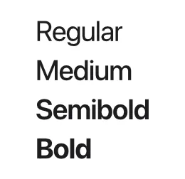
.font is inherited: set it on a stack and it applies to every text inside,
unless a view inside sets its own.
VStack { Text("Both lines") Text("are 12 points")}.font(size: 12)The font size also sizes icons, so an icon next to text matches it.
Colors
Section titled “Colors”.color(…) sets the color of text and icons. Like .font, it’s inherited by
everything inside a stack.
Text("Error").color(.red)Text("Details").color(.secondary)Colors are values of the built-in Color type, written with a leading dot:
| Color | Use |
|---|---|
.primary | The default text color: near black, or near white in the dark appearance. |
.secondary | Gray, for less important text. |
.gray, .lightGray | Neutral grays. |
.red, .orange, .yellow, .green, .blue, .purple, .pink | Accent colors. |
.white, .black | Pure white and black. |
.clear | Fully transparent. |
.sidebar | A very light gray, for side panels. |
.highlight | A light blue, for selected rows. |
.separator | The gray used by Divider(). |
.background | The window’s background. |
.rgb(r, g, b) | A color of your own, from red, green and blue (each 0 to 255). |
.rgba(r, g, b, opacity) | The same, see-through: opacity goes from 0 to 1. |
See the colors reference for swatches and exact values.
Your own colors
Section titled “Your own colors”.rgb and .rgba make any color. Like every Color, one can be kept in a
let, passed to your own views, and compared:
let brand: Color = .rgb(255, 136, 0)
Text("Sale").color(.white).padding(8).background(brand, radius: 8)Text("Soon").padding(8).background(.rgba(255, 136, 0, 0.2), radius: 8)
A web color like #FF8800 is .rgb(255, 136, 0): its three pairs of digits
are red, green and blue, in base 16.
Light and dark
Section titled “Light and dark”An app looks light or dark as the system does, and changes with it while it runs. Text, the window, the built-in controls and the named colors all have a version for each:
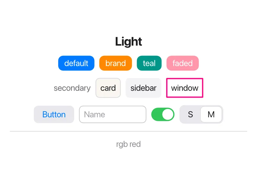
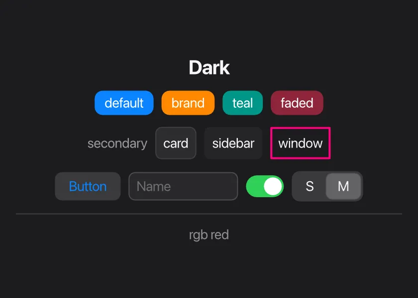
To look right in both:
- Leave text its default color, or use
.primaryand.secondary. - For backgrounds, use
.background,.sidebar,.lightGrayand.highlight, which are dark in the dark appearance..whiteand.blacknever change, and neither do.rgbcolors. - For a color of your own in each appearance, ask
isDarkMode():
let card: Color = if isDarkMode() { .rgb(44, 44, 46) } else { .rgb(250, 246, 240) }isDarkMode() is true while the app shows in its dark appearance. The app is
built again when the appearance changes, so views that use it follow.
An app that should always look one way says so:
app Player(appearance: .dark) { …}appearance: is .system (the default), .light or .dark.
A Button’s label is blue by default. Setting .color on the button itself
changes it; a color inherited from an outer stack does not.
Backgrounds and borders
Section titled “Backgrounds and borders”.background(color, radius:) fills the view’s area with a color, and
radius: rounds the corners. .border(color, width:, radius:) draws an
outline; the width is 1 point unless you say otherwise.
Text("background").padding(8).background(.yellow)Text("radius: 8").padding(8).background(.lightGray, radius: 8)Text("border").padding(8).border(.blue, width: 2, radius: 8)Text("opacity").padding(8).background(.green, radius: 8).opacity(0.4)Button("Disabled") {}.disabled()
The background and border cover the view’s whole area, including its padding,
so padding is what gives text some room inside its background. (The order of
.padding and .background doesn’t matter; see
the note on modifier order.)
The border is drawn on top of the view’s content, the background behind it.
Opacity
Section titled “Opacity”.opacity(value) makes a view and everything inside it see-through, from 0
(invisible) to 1 (solid). An invisible view still takes up its space and can
still be clicked; to remove it, use .hidden().
Hiding and disabling
Section titled “Hiding and disabling”.hidden() removes a view from the window: it isn’t drawn, takes no space,
and can’t be clicked. .disabled() keeps the view visible but faded, and it
doesn’t react to clicks or keyboard shortcuts. Both apply to
everything inside the view.
Both take an optional Bool, so you can switch them on a condition:
Button("Send") { send() }.disabled(message == "")Text("Saving…").hidden(!saving).hidden(true) is the same as .hidden(), and .hidden(false) shows the view
normally.
An if also shows and hides views, so when should you use .hidden? The
difference is that a hidden view still exists: if it’s a custom view with
state, that state is kept while it’s
hidden. A view left out by an if is gone, and its state with it.
Hover backgrounds
Section titled “Hover backgrounds”.hoverBackground(color, radius:) draws a background while the mouse pointer is
over the view. It’s meant for things you can click that don’t look like
buttons, such as rows in a list or icon buttons in a toolbar, and goes together
with .onTap:
HStack { Icon(.file) Text("notes.txt") Spacer()}.padding(4).hoverBackground(.lightGray, radius: 4).onTap { open() }It works on any view, not only ones you can click. When views with a hover background are nested, only the innermost one under the pointer shows its hover background.
Text alignment
Section titled “Text alignment”.textAlignment(.leading | .center | .trailing) lines up the lines of a
multi-line text. It’s covered in
Alignment.
Animation
Section titled “Animation”Normally a view that changes is drawn in its new place at once. With
.animation(), a view and the views inside it take a moment to get there:
app Drawer(width: 360, height: 200) {    state open = false
    HStack(spacing: 0) {        VStack {            Text("Menu")        }        .frame(width: if open { 160 } else { 40 }, maxHeight: .infinity)        .background(.sidebar)
        Button(if open { "Close" } else { "Open" }) { open = !open }            .frame(maxWidth: .infinity)    }    .animation()}
Clicking the button widens the side panel smoothly, and the button slides along, instead of both jumping.
What’s animated, between one state of the UI and the next:
- a view’s position and size,
- its
.opacity, - its
.backgroundcolor (one that’s added or removed fades in or out), - and a view that appears fades in.
.animation() takes a quarter of a second; .animation(0.6) takes 0.6
seconds. It covers the view it’s on and everything inside it, so putting it on
your outermost stack animates the whole window. .animation(0) turns it off
again for a part.
A few things to know:
- A view that disappears is gone at once (the views around it then move to fill the gap).
- Tessel tells views apart by their position among their neighbors. When views
are added or removed in the middle of a list, give each one an
.id, so that the right ones move. - Scrolling and resizing the window aren’t slowed down.
- A
Togglealways slides, with or without.animation.
Longer text with Markdown
Section titled “Longer text with Markdown”A Text has one font and one color. For text with more to it (a heading, a
list, a word in bold, a link, a table), write it in
Markdown and show it with Markdown:
app Notes(width: 420, height: 330) {    state opened = ""    let page = "## Release notes\n\nVersion **2.0** is out. It adds:\n\n- a *dark* appearance\n- faster `search()`\n\n| Key | Does |\n|---|---|\n| Cmd+F | Find |\n| Cmd+S | Save |\n\nRead the [full list](/changes/)."
    VStack(spacing: 8, alignment: .leading) {        Markdown(page, onLink: { link in opened = link })        Text("Opened: {opened}").color(.secondary)    }    .padding(16)}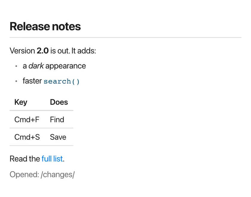
Usually the text comes from a file, with
readFile, rather than from a string in the
program. Put the view in a Scroll when the text may be longer than the
window.
When a link is clicked, onLink gets its address, as it’s written in the
text: what happens then is up to you. Without onLink, links to the web open
in the browser.
The reference lists what’s shown (and what isn’t). The documentation in the Tessel IDE is shown with this view.